flex 布局
容器 container
内容 items
属性:
flex-direction 主轴对齐方式
flex-direction是设置主轴的方向即项目的排列方向,分为X轴和Y轴,行或列
默认值是X轴 从左到右的
主轴和侧轴是会变化的,就看flex-direction设置谁为主轴,剩下的就是侧周。而我们的子元素是跟着主轴来排列的
row 默认值从左到右
row-reverse 从右到左
column 从上到下
column-reverse 从下到上
1
2
3
4
5
6
7
8
9
10
11
12
13
14
15
| div {
display: flex;
width: 80%;
height: 300px;
background-color: pink;
flex-direction: column;
}
div span {
width: 150px;
height: 100px;
background-color: purple;
}
|
flex-wrap:换行
默认情况下flex-wrap 的值是 no-wrap
wrap 换行
wrap-reverse 换行且翻转
1
2
3
4
5
6
| div {
display: flex;
width: 80%;
height: 300px;
flex-wrap: wrap;
}
|
justify-content改变主轴内容的排列方式
使用之前一定要确定好主轴是哪个
是设置主轴上子元素的排列方式
1
2
3
4
5
6
7
8
9
10
11
12
13
14
15
16
| div {
display: flex;
width: 80%;
height: 300px;
background-color: pink;
justify-content: space-between;
}
|
align-items改变次轴的对齐方式
1
2
3
4
5
6
7
8
9
10
11
12
13
| div {
display: flex;
width: 800px;
height: 300px;
background-color: pink;
flex-direction: column;
justify-content: center;
align-items: center;
}
|
多行内容是使用align-content
align-content只能用于子项出现换行的情况(多行),在单行下是没有效果的
1
2
3
4
5
6
7
8
9
10
11
12
13
14
15
| div {
display: flex;
width: 800px;
height: 500px;
background-color: pink;
flex-wrap: wrap;
justify-content: space-between;
align-content: space-between;
}
|
item 属性:
order 属性可以改变 flex显示内容顺序
first-child{} 意思是选择第一个类为 item 的元素
nth-child(){} nth意思是第n个 (index顺序数值)
1
2
3
4
5
6
7
8
9
10
11
12
13
|
div span:nth-child(2) {
order: -1;
}
div span:nth-child(1) {
align-self: flex-end;
}
div span:nth-child(3) {
align-self: flex-end;
}
|
flex-grow:如果有多余的空间就把空间分给带有该属性的元素,冒号后面跟份数
1
2
3
4
5
6
7
8
9
10
11
12
13
14
15
16
| section div:nth-child(1) {
width: 150px;
height: 150px;
background-color: purple;
}
section div:nth-child(2) {
flex: 1;
background-color: red;
}
section div:nth-child(3) {
width: 150px;
height: 150px;
background-color: skyblue;
}
|

flex-shrink 控制变窄程度
一般写flex-shrink:0 防止变瘦,默认是1,同步变窄
在空间不足以放下元素本身时,谁的数字越大谁缩小的越快
1
2
3
4
5
6
7
8
9
10
11
12
13
14
15
| .item:first-child {
flex-grow: 1;
flex-shrink: 10;
}
.item:nth-child(2) {
flex-grow: 1;
flex-shrink: 0;
}
.item:nth-child(3) {
flex-grow: 1;
flex-shrink: 10;
}
|
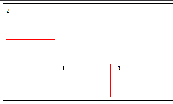
align-self: flex-end 某一个item可以特立独行,写在元素里
1
2
3
4
5
6
7
8
|
div span:nth-child(2) {
align-self: flex-end;
}
div span:nth-child(3) {
align-self: flex-end;
}
|
重点
记住这些常用代码
display: flex
flex-direction: row / column
flex-wrap : wrap
just-content: center / space-between
align-items:center
经验
永远不要吧width 和 height 写死,除非特殊说明
用 min-width / max-width / min-height / max-height
flex 可以基本满足所有需求
flex 和 margin-x: auto 配合有意外的效果
写死
width:100px
不写死
width:50%
max-width:100px
width :30vw
min-width:80%
特点:不使用 px,或者min max 前缀